

Asdrubal Franco, Andres Azpurua (Domoarchitecture+Onsite)
Conceived as an investment to fund MoMA’s expenses, six of the tower’s 52 floors are used by the museum. The building contains a total of 240 apartments.

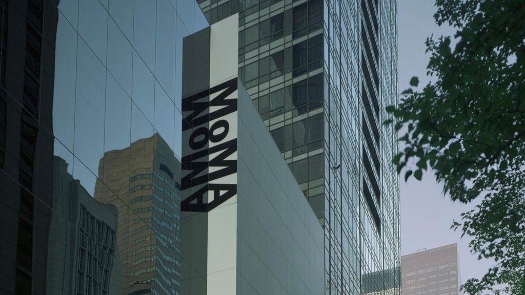
In 1929, some of America’s leading, progressive patrons of the arts – Lillie P. Bliss, Cornelius J. Sullivan and John D. Rockefeller Jr. – decided to create an institution to host “the world’s greatest museum of modern art”. Ten years later, the New York Museum of Modern Art, MoMA first opened its doors in Midtown Manhattan. Since then, it has become one of the world’s richest and most complete collections of modern art. In the ‘50s and ‘60s, the Museum needed more space to house its ever-expanding collection. A master of the International Style, Philip Johnson, was commissioned to design the project, which endowed the museum with its famous Abby Aldrich Rockefeller Garden for sculptures.
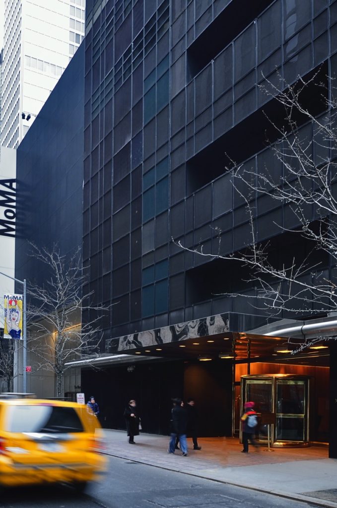
In 1984, to mark the institution’s 50th birthday, further extension work was carried out, doubling the exhibition space and building an auditorium, two restaurants, a bookshop and the Museum Tower. Conceived as an investment to fund the museum’s expenses, the tower that Pelli Clarke Pelli Architects designed is 52 floors high, six of which are dedicated to the museum. The building offers a total of 240 apartments.

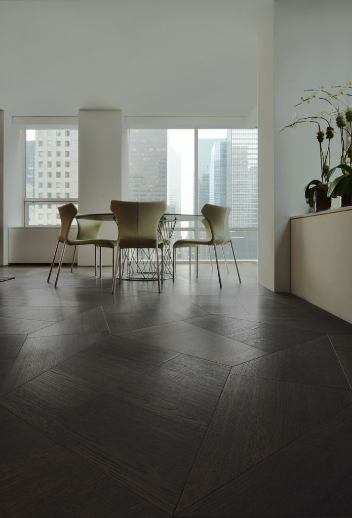
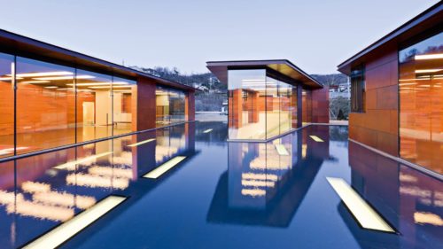
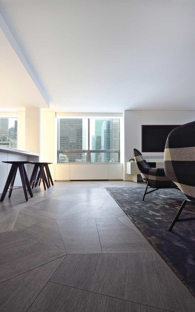
With a reinforced concrete structure and a curtain wall featuring multi-colored glazing and a spandrel strip in eleven different shades, the residences offer matchless views over the city through full-height windows, some of which are corner views.
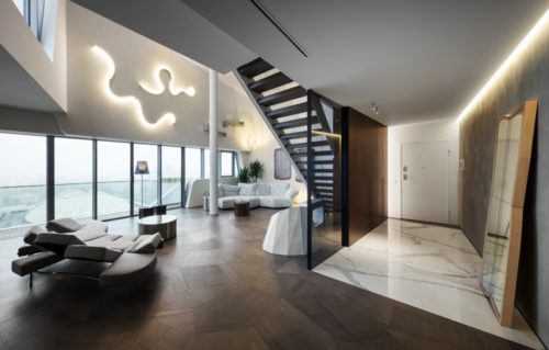
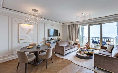
The views out over the city are enhanced by the neutrality of the interior, which, like photographs, are framed by full-height glass panels.
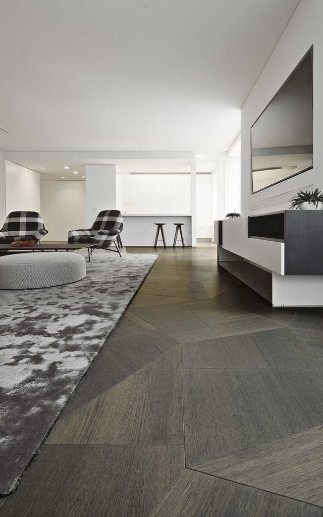
Although the apartments may be limited in size, they may be knocked through to form larger, more commodious living spaces. Characterized by elegance and comfort, they are particularly luxurious places to live.

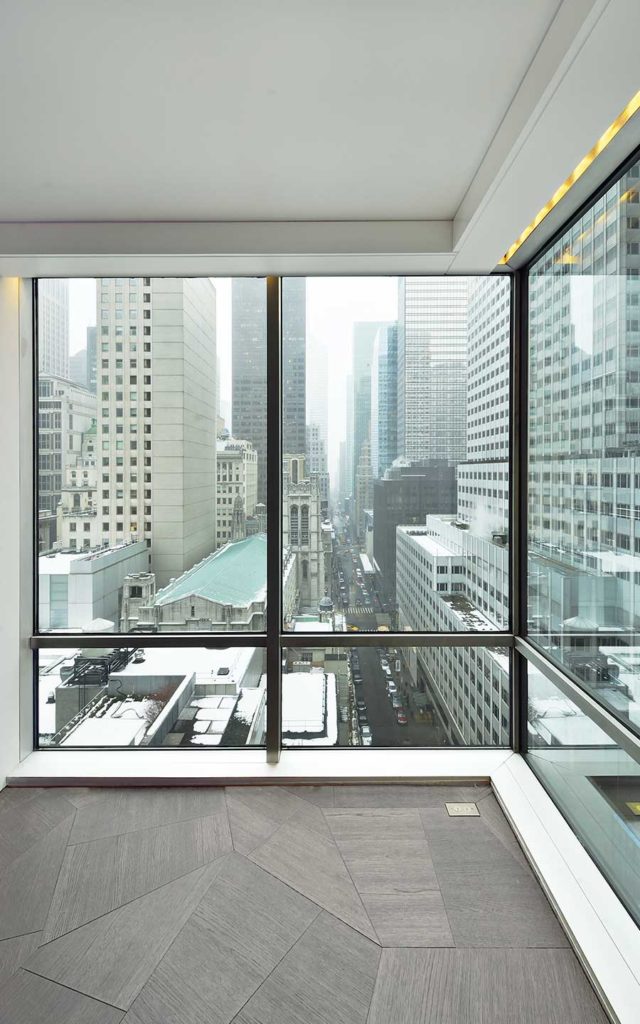
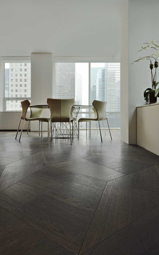
In the apartment where Asdrubal Franco and Andres Azpurua were responsible for the interior design, they focused on a homogeneous white-based color scheme for the ceilings, walls and furnishings. The views out over the city, the city streets and its skyscrapers are highlighted by the neutrality of the interior, and are framed like photographs by full-height glass panes.
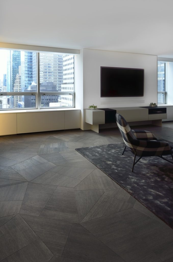
The dominant colour is white for the furniture, ceiling and walls, where the windows are framed like landscape paintings. The uniformity of colours creates a sense of seamless space, enhanced by the flooring being the same throughout the flat. The project designers chose wooden surfaces, by Daniele Lago for Listone Giordano, with a geometrical pattern inspired by the golden ratio.
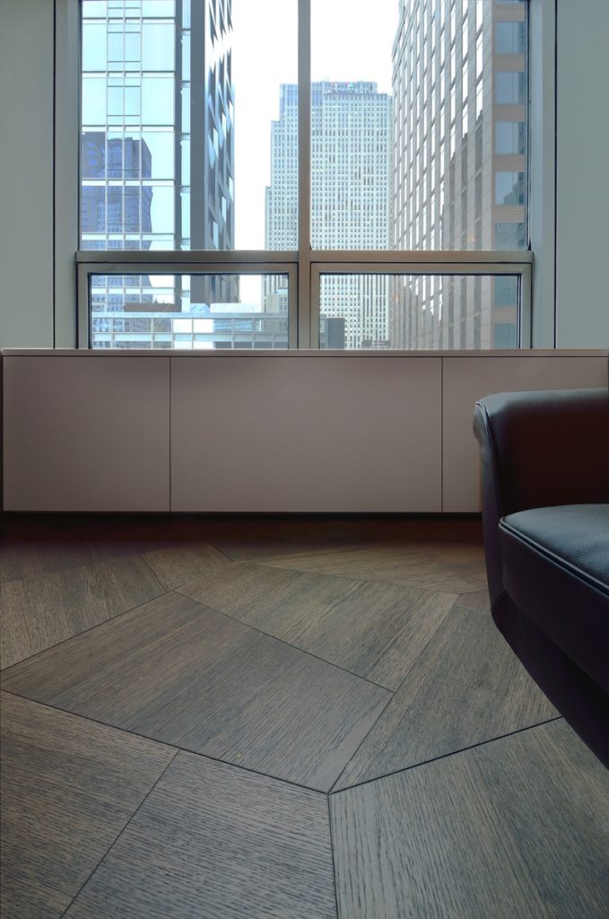
The three trapezoidal oak modules of the Slide collection can be juxtaposed in different ways to convey the overall impression of a random pattern, enriching the visual and formal impact and overturning the classic image of a wooden floor. The tone chosen contrasts with the prevailing white and the geometrical patterns of the floor create a dynamic play of lines, corners and colour nuances that further enhances the apartment and Cesar Pelli’s architecture.
Photo by Stefano Pasqualetti